How early encounters with wayfinding, technology, and public systems became a design practice centered on clarity, trust, and lasting consequence.

Part two of a reflection on the ideas behind my portfolio’s interactive homepage. Part one is Looking Through the Network.
I don't remember the first time I noticed design, but I remember trusting it.
As a child, I regularly traveled between the United States and Honduras, so airports became familiar long before I understood the systems that made them work. I couldn't have explained wayfinding or information architecture, but I understood their effects instinctively: a pictogram could tell me where to stand, a color could signal caution, and an arrow could guide thousands of strangers, speaking different languages, toward the same destination without a conversation.
Design was already helping people move through the world before I had the language to describe it.
Years later, another kind of navigable environment appeared in my life: the early web. In the mid-to-late 1990s, before search became nearly invisible, finding something online often required wandering through directories, following links across personal websites, and entering communities whose edges were difficult to define. Yahoo, AltaVista, HotWired, forums, and independent pages made the web feel less like a library and more like a territory.
I taught myself HTML and CSS because I wanted to participate in that territory, and I didn't just want to consume what other people had made; I wanted to contribute something of my own—something another person might encounter while following an unexpected path.
The web expanded the boundaries of the world immediately around me because it gave me access to designers, musicians, artists, and communities whose work had little presence where I grew up in the Antelope Valley. I followed the Designers Republic and participated in its online community, and I sought out electronic music, experimental typography, unusual animation, installation art, and cultural work that asked more from its audience than immediate recognition.
What attracted me wasn't obscurity for its own sake, but the discovery that human creativity could take forms I had never been shown. Design could be practical and poetic, and it could communicate clearly while remaining provocative, playful, or strange. It could help someone find a gate at an airport, but it could also challenge someone to reconsider what they were looking at.
In high school, with encouragement from my family, I subscribed to Wired, The Futurist, and, for a time, The Wall Street Journal during the dot-com boom. I was fascinated by artificial intelligence, biotechnology, accelerating computing power, and speculation about how emerging technologies might reshape society, and rather than studying the future as a detached observer, I wanted to be part of it.
That fascination has never left me, and I genuinely love technology: computers, interfaces, games, controllers, gadgets, tools, and the physical details through which people interact with them. I don't see that enthusiasm as being in conflict with human-centered design because the two reinforce each other, and the more deeply technology becomes embedded in everyday life, the more consequential the relationship between a system and the person using it becomes.
I later studied multimedia and web design alongside foundational design, art history, and contemporary art, and installation work remained especially compelling because it treated the audience as a participant rather than a passive viewer. The work didn't exist solely as an object; it created a condition someone entered, moved through, and interpreted.
That distinction—between presenting something and creating the conditions for participation—has remained central to my practice.
Design as a relationship
Human-centered design wasn't a late-career revelation for me, because the conviction that design should help people has always felt fundamental.
The language and scale of the problems have changed, but the basic questions have remained consistent. How does someone enter this? How do they know where they are? What helps them move forward confidently? What does the system communicate before anyone reads its explanation? Who may be confused, discouraged, or excluded by a decision that appears insignificant from inside the organization?
Design is problem-solving and communication, and both occur through relationships: between a person and a product, a community and an institution, a participant and a research program, or a new computer owner and an operating system.
Every system teaches people something about the relationship they are expected to have with it, and while that lesson is sometimes intentional, it often isn't. A system can make someone feel capable or uncertain, welcomed or peripheral, respected or processed.
My work begins by taking that relationship seriously.
This doesn't mean aesthetics are secondary or that visual experimentation is indulgent, because form affects meaning and beauty can create attention, confidence, recognition, and delight. But visual distinction earns its place when it supports the experience rather than competing with it.
Coolness isn't the goal. Elegance is what happens when aesthetics, communication, accessibility, and usefulness converge.
Making science legible
The clearest examples of this ethic appear in projects where communication has meaningful consequences.
For the Clinical and Translational Science Institute at the University of Pittsburgh, the work involved making complex scientific information more legible and approachable to the people who needed to navigate it. The challenge wasn't to simplify science until it became superficial, but to create a clearer relationship among institutions, investigators, healthcare professionals, and the communities that research ultimately exists to serve.
Scientific and institutional systems often become difficult to navigate precisely because they contain so much knowledge, so many stakeholders, and so many internal structures. From within the institution, that complexity can feel inevitable, but from outside it, the same complexity can make participation seem inaccessible.
Design provides a way through, not by pretending the complexity is absent, but by deciding what someone needs at a particular moment and making the next step understandable.
The artifact may be a website, a navigation system, or a visual language. The deeper outcome is a person who can find the information, resource, or relationship they came for.
From communication to participation
For the All of Us Research Program, I helped establish and evolve a visual and communication language across digital experiences, paid media, out-of-home work, email, landing pages, and related program communications.
The project mattered to me because its stakes extended beyond the campaign itself, and All of Us was asking people to understand and participate in a major long-term research effort. That invitation involved time, attention, personal information, and trust, and if the communication felt impersonal, confusing, or disconnected from the people it hoped to reach, potential participants could miss an opportunity to contribute to medical research intended to represent a much broader population.
My concern wasn't simply whether the work looked distinctive, but whether the program could meet people with enough clarity, warmth, and relevance to be understood.
The branding and visual language developed across many touchpoints rather than living inside one interface, and that continuity mattered because a person might first encounter the program through an advertisement, an outdoor placement, an email, a landing page, or a research-related website. Each expression had to feel connected to the same invitation and worthy of the same trust.
Design can't manufacture trust. It can, however, support trust or quietly undermine it.
It can communicate with honesty, reduce unnecessary friction, represent people with care, and help a relationship begin on more solid ground.
That's where the work moves from artifact to consequence, because if communication helps someone understand the purpose of a research program, see themselves represented in it, and decide to participate, the effect extends beyond the campaign. The visual work may eventually be revised or replaced, but the participation it enabled may continue through the research, the people represented in it, and the medical knowledge that follows.
Respecting the range of users
The same responsibility appears in projects with a more contained scope.
An out-of-box setup experience for Windows might seem primarily functional, and while it must respect the Microsoft brand and feel visually resolved, it also has to work for an enormous range of people. A technically confident person may move through it almost without thinking, but someone older, less experienced, or uncertain about what a choice means may experience the same screens very differently.
An early visual direction can look impressive and still ask too much of the person using it. Iteration is the point at which visual ambition must meet responsibility. The interface should feel contemporary and elegant, but it should also make the next action clear, provide meaningful feedback, and avoid turning novelty into friction.
Designing for a broad audience doesn't require removing character, but it does require knowing which kind of expression supports the interaction and which kind exists mainly to display the designer’s cleverness.
This is a practical form of care: anticipating that the person on the other side may not share the designer’s knowledge, confidence, abilities, or context, and refusing to treat that difference as a failure on their part.
What remains after the artifact
Websites are replaced, campaigns end, and interfaces are redesigned, so I'm not particularly sentimental about preserving a design merely because I worked hard on it.
The value of the work isn't that it remains untouched, but what it enables while it exists.
A design may help someone understand, trust, enroll, participate, complete a task, or make a consequential decision.
The pixels eventually disappear. The outcome may continue.
This is why bringing care to the work doesn't mean becoming precious about the artifact, and when the design fails, it needs to change, while changing circumstances may require it to disappear. The responsibility is to the relationship and the outcome, not to preserving the evidence of one designer’s effort.
It's also why the smallest decisions matter: a headline can clarify an invitation or obscure it, a navigation label can help someone locate a resource or convince them it isn't meant for them, a visual flourish can create delight or interrupt a task, and a representation of a community can build recognition or reinforce distance.
None of these decisions exists only on the screen. Each one influences what a person can understand or do next.
How I show up
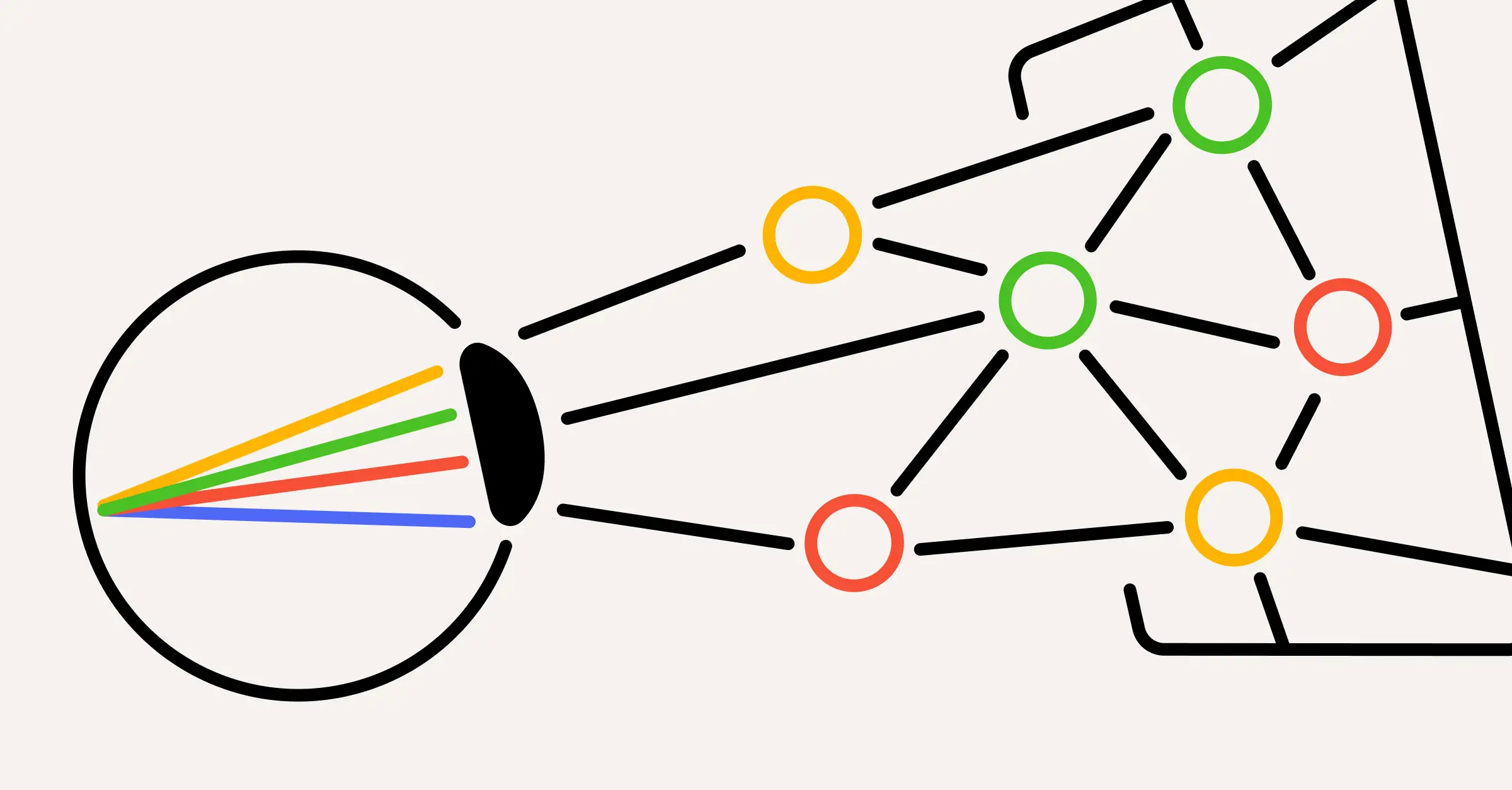
The interactive artwork on my homepage gives this ethic a visible form. Its network, human figure, and invitation to participate aren't a new philosophy constructed for a portfolio. They're a distillation of questions that have been present throughout my life and work.
The child trusting airport signs, the teenager contributing to the early web, the person fascinated by technology’s possibilities, and the designer working inside complex institutions aren't separate identities. The tools have changed, but the attention has remained consistent.
I continue to love the systems themselves—their logic, possibilities, visual languages, and ability to create new forms of experience—and looking through a system to find the human doesn't require dismissing the system. It requires understanding it well enough to recognize what it asks of people and what it makes possible for them.
That's how I show up to the work.
I look beyond the visible request without losing sight of the practical one, and I try to understand what relationship is being created and who will have to live with its consequences, while making room for rigor and play, technological enthusiasm and human consideration, visual expression and restraint.
The artifact will change. What matters is what happens afterward: whether someone understands, trusts, participates, acts, or sees a possibility that had previously been obscured.
That's the outcome I care about—and the kind of problem I want to keep looking through.